Setting Up The Menu
LEVELUP supports customizable menus of WordPress, with several main menu dropdown levels. It also supports single leveled dropdown for the multi-columns menu. The single-leveled multi-columns menu can contain up to four columns. Menu locations can be attached with the custom menu.
Clasic Menu

Multi-columns menu

Drop-down Menu

Mega-menu
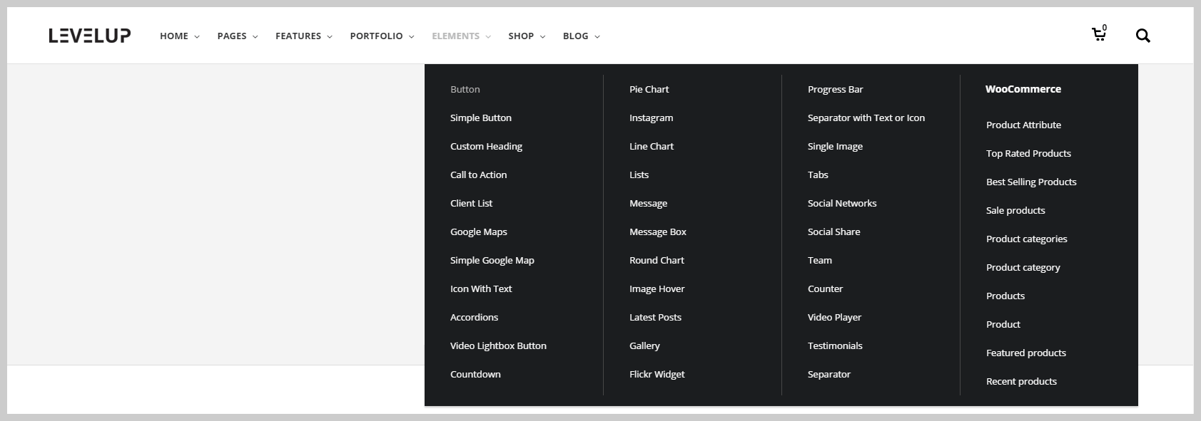
LEVELUP Menus Have Extended Theme Options
LEVELUP has the options for the menu customization as well. You may check all of those in Appearance > Theme Options > Menu tab. The link color, background, icon, padding, and attach custom Widget area are fully customizable by the user.
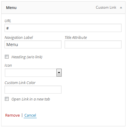
How To Setup A New Menu
Stage 1 - Go to Appearance > Menus tab at the administrator sidebar.
Stage 2 - Hit the “Create A New Menu link” to create a new menu. Put the name in and hit the Create Menu button after.
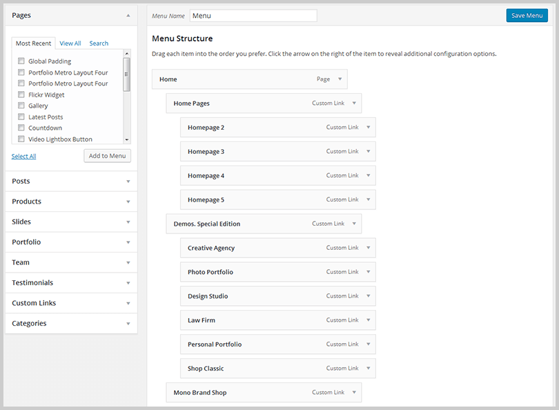
Stage 3 - In order to add an item of the menu, choose one of your created pages on the left-hand side and hit the Add to Menu button. You are also able to add all kinds of different posts from the left side.
Stage 4 - For the custom menu item to be added, please enter a custom name and link into the Links box.
Stage 5 - Use drag & drop functions to set up your menus. You are able to drag a menu item below and slightly to the right of another menu item to create a dropdown menu, and it will lock into place and create a dropdown section.
Stage 6 - When the menu is set up, scroll down to the bottom of the page to attach the menu to Primary Menu Area.
Stage 7 - Once it's all done, please do not forget to hit the Save button.
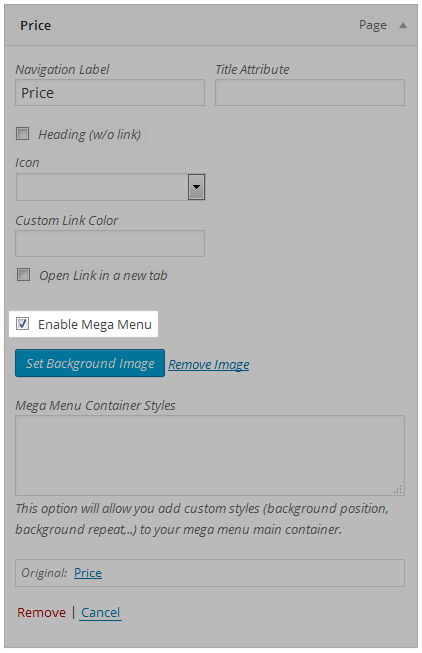
Add necessary CSS code into Mega Menu Container Styles area to fine tune your background image.
Here is a list of common CSS codes that you can use for this option:
| Property | Values | Description |
|---|---|---|
| background-position |
left top left center left bottom right top right center right bottom center top center center center bottom x% y% xpos ypos |
The background-position property sets the starting position of a background image.
If you only specify one keyword, the other value will be “center” The first value is the horizontal position and the second value is the vertical. The top left corner is 0% 0%. The right bottom corner is 100% 100%. If you only specify one value, the other value will be 50%. Default value is: 0% 0% The first value is the horizontal position and the second value is the vertical. The top left corner is 0 0. Units can be pixels (0px 0px) or any other CSS units. If you only specify one value, the other value will be 50%. You can mix % and positions. |
| background-repeat |
repeat repeat-x repeat-y no-repeat |
The background-repeat property sets if/how a background image will be repeated.By default, a background-image is repeated both vertically and horizontally. Tip: The background image is placed according to the background-position property. If no background-position is specified, the image is always placed at the element’s top left corner |
| background-size |
auto cover contain x% y% xpix ypix |
The background-size property specifies
the size of the background images.
auto: Default value. The background-image contains its width and height. cover: Scale the background image to be as large as possible so that the background area is completely covered by the background image. Some parts of the background image may not be in view within the background positioning area. contain: Scale the image to the largest size such that both its width and its height can fit inside the content area. x% y%: Sets the width and height of the background image as a percentage of the parent element. The first value sets the width, the second value sets the height. If only one value is given, the second is set to “auto”. xpix ypix: Sets the width and height of the background image. The first value sets the width, the second value sets the height. If only one value is given, the second is set to “auto”. |
Example (CSS code):
background-repeat: no-repeat; background-position: right bottom; background-size: auto;
Using of The Mega Menu
LEVELUP also contain the built-in mega menu that can be activated and set up via the main menu. It can contain from 1 to 6 columns, so the user is able to take any widget and have icons/images and more. Please check the instructions bellow to see the setup procedure.
How To Create A Mega Menu
Stage 1 - Go to Appearance > Menus section of your administrator sidebar and choose the Create a New Menu link to get a new menu, or edit a current one that you may already have.

Stage 2 - Only First Level items can activate the Mega Menu, hit the Arrow icon next to any First Parent Level menu item for the Options box to be expanded. You will see an option called Enable Mega Menu, check the box to activate the Mega Menu.
Stage 3 - The second level forms a separate column mega menu along with the first item in this column. A number of items in the second menu level settle the count of columns in the Mega Menu. Important! Second-level menu in the mega-menu serves only as a separator, and even if the "Navigation Label" is specified, it won't be displayed. If you check "Title Only", the "Navigation Label" will be displayed as a title with no link. (You can see an example on the picture below)
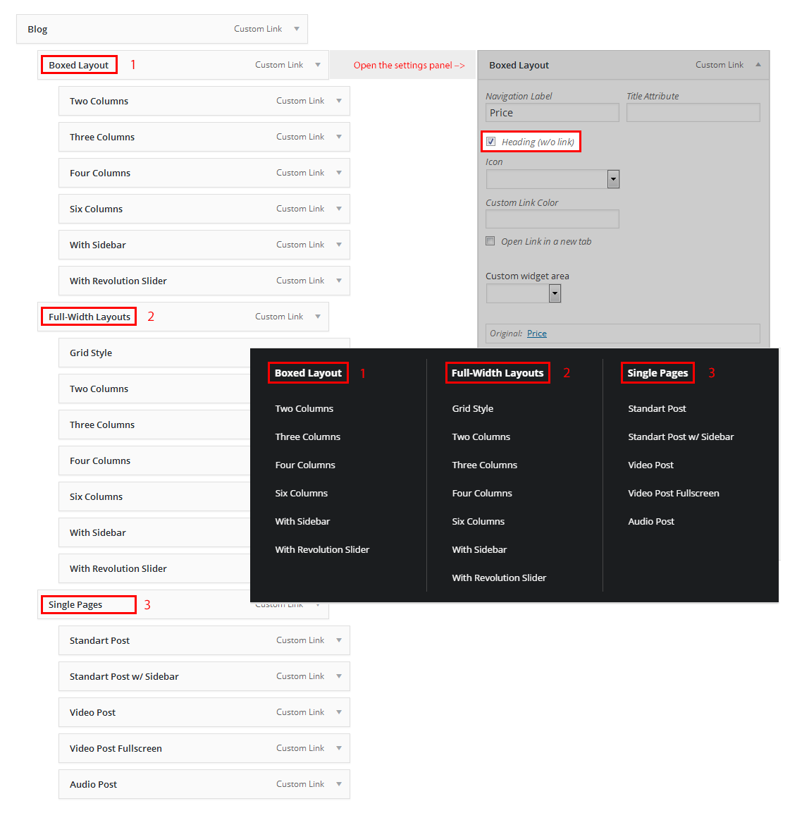
Stage 4 - The third level elements generate a list of the mega menu in the column.
Stage 5 - Each menu item can have a font awesome icon, choose it from Icons drop-down chooser.